Welcome to Covid19 Visualization Project’s documentation!
Indices and tables
Background and task
A common way of viewing statistics related to the COVID-19 pandemic has been dashboards. It led to the development of various data sources and programmatic ways of access. However, simply showing data without the underlying context may be misleading. Hence, bringing additional information that helps to understand and interpret data is critical. We would love to see your ideas for building pipelines that fetch data and relevant contextual information.
Set up a data processing and visualization pipeline for COVID data. You will retrieve the data from a public API (e.g., covidtracking.com), write code to process the data as needed, and provide visualizations of COVID infections over time.Thetask should:
Allow interactive exploration and interpretation of covid infections in selected countries (e.g., US)
Deliver a reproducible pipeline that re-executes automatically
Provide a clean and well-documented code
Database
The covid tracking project compiled US COVID-19-related data from
02/2022 until 03/2021. It provides data by day and state in three main
areas: testing, hospitalization, and patient outcomes. Data is provided
via an API that can
be used to retrieve a json file.
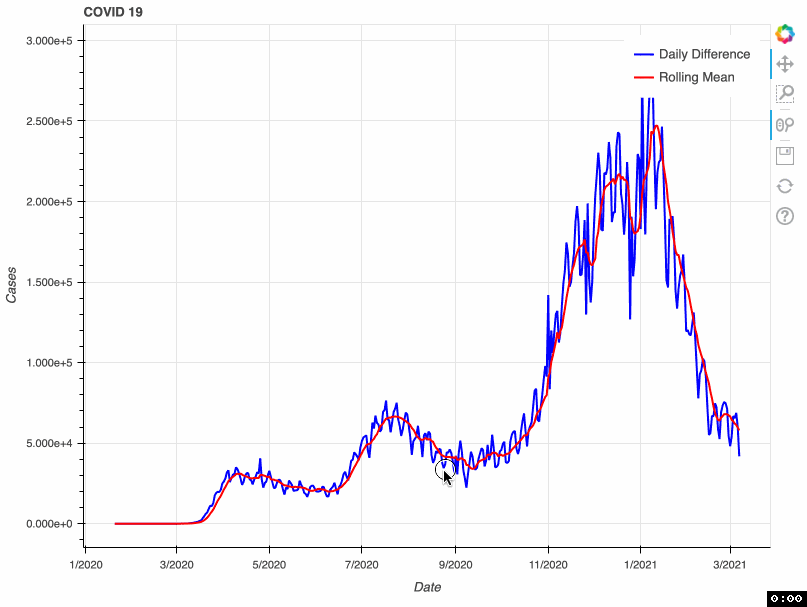
As a proof of concept, this tool takes from that database the total number of COVID-19 cases by day. This metric is accumulative; therefore, if we want to visualize daily COVID-19 cases, we need to transform the original data and calculate the difference. Some US health bureaus reported cases only on weekdays, while others did it uninterrupted daily. This explains why we see a drop in the number of cases during the weekend. To correct this “noise”, the tool calculates a rolling mean with a window of 7 days. This transformation smoothes the signal and corrects this artifact; however, it tends to hamper the detection of fast changes in the signal.
Solution:
The schema of the solution proposed for this task is represented in the
graph below. PySpark will be used for the ETL job and Bokeh for
generating the interactive visualization. Selected data is extracted
from the database API. Then, after a data validation checking, several
transformations are applied to the data, such as the conversion of
dates, calculation of daily differences, and time-series sequence
smoothing via rolling mean. Next, data is loaded into a parquet
database. This loading process checks for duplicates, and therefore it
can be run repeatedly without affecting the database.

Finally, the data previously loaded in the parquet database is used to
generate a bokeh interactive plot in html.
In this proof of concept, I used the total number of COVID-19 cases. However, it can be adapted to any of the metrics available in the API.
Project Structure
The structure of the project is inspired from this repository.
root/
 |-- configs/
 |   |-- configs.json
 |-- dependencies/
 |   |-- logging.py
 |   |-- spark.py
 |-- COVID19_project/
 |   |-- __main__.py
 |   |-- extract.py
 |   |-- transform.py
 |   |-- load.py
 |   |-- visualize.py
 |-- tests/
 |   |-- test_data/
 |   |-- | -- test_to_date.parquet
 |   |-- | -- ...
 |   |-- test_transform.py
 |   |-- data_generator.py
 |   requirements.txt
The ETL task and visualization tool are contained in
COVID19_project. There, each file contains the methods required for
each part of the project: extraction, transformation, loading, and
visualization. Different parameters can be configured in
configs/configs.json and then used in transformation methods.
Additional modules that support the pySpark session and logging can be
found in dependencies. Finally, unit test modules are stored in
tests next to small representative portions of input and output data.
Each of the transformations methods has its own test function.
Ideas for further development
Visualization
Extract daily cases per state.
Integrate states databases with their geoboundary in a geoparquet file.
Develop a map visualization of US with a colormap depending on the cases.
Database
Implement a Hadoop/HIVE database to test performance.
Querying
Allow custom SQL queries to retrieve information from the database.